Northwest Passage 7-22 September 2025
Join Peter Eastway on a voyage to Canada's amazing Northwest Passage.


If you are already a subscriber to Better Photography or one of our many other courses, you'll need to login at our sister website, www.betterphotographyeducation.com. Yes, it's a little confusing - and you should complain bitterly to our editor about it! However, in the meantime, click on any of the links in this panel to be taken directly to the Better Photography Education website where your reading and viewing material is awaiting your return!
 |
 |
|
 |
 |
Click here to visit the Better Photography Education Website |
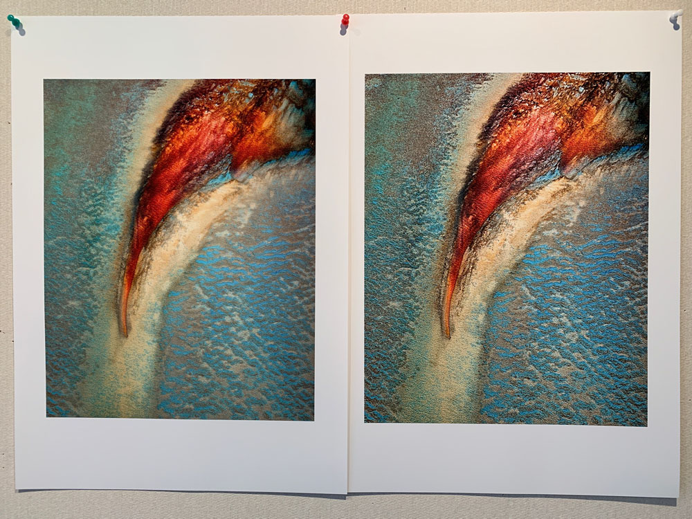
Prints on my review pinboard. Canson Baryta Photographique II Matte, Epson SC-P10070 printer.
Images from Shark Bay, 2023
Size makes an incredible difference to a photograph and if you get a chance to listen to Les Walkling talk about the importance of size in an exhibition print, take it! Most of the images we see are on screens. Most people use very small screens. Yet so much enjoyment is lost when you only view photographs on small screens.
This is one of the reasons I continue to love prints so much. Yes, my EIZO monitor is bloody wonderful (and full disclosure, I'm an EIZO, Canson and Epson ambassador), but when we view our images on screen, we're viewing an image with a resolution of 96 (or maybe 140) pixels per inch. Compare this with a print that is has been produced with around 2400 dots per inch and it doesn't take Einstein to work out that some fundamental picture information has gone missing, no matter how you measure things!
Don't get me wrong - small screens allow us to share photographs much more easily than prints, but I worry that as photographers, we're forgetting how good our photographs can be. I mean, surely we don't purchase a camera with a 40- or 50-megapixel sensor to produce photos that are only shown on a smart phone?
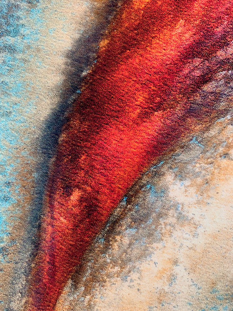
Recently I was discussing the choice of printing paper for our Shark Bay aerials with one of our 'students'. Introducing a textured paper didn't seem to work particularly well because there was already so much texture in the subject (the water ripples and sand patterns). Similarly, we can be tempted to shift the clarity or dehaze filters to the right because the resulting screen image looks so good.
However, when you then make a print, the real impact of your zest for clarity becomes a little clearer - and this is why I have the two prints up on my board. The first one had plenty of clarity and contrast to bring out the texture in the water and sand, but when I made a print, there was too much 'crunchiness'. The contrast was getting in the way of the subject detail. I re-processed the file, leaving out the clarity and much preferred the 'smoothness' of tone and colour that resulted.
Just some food for thought. You can see detail prints below.
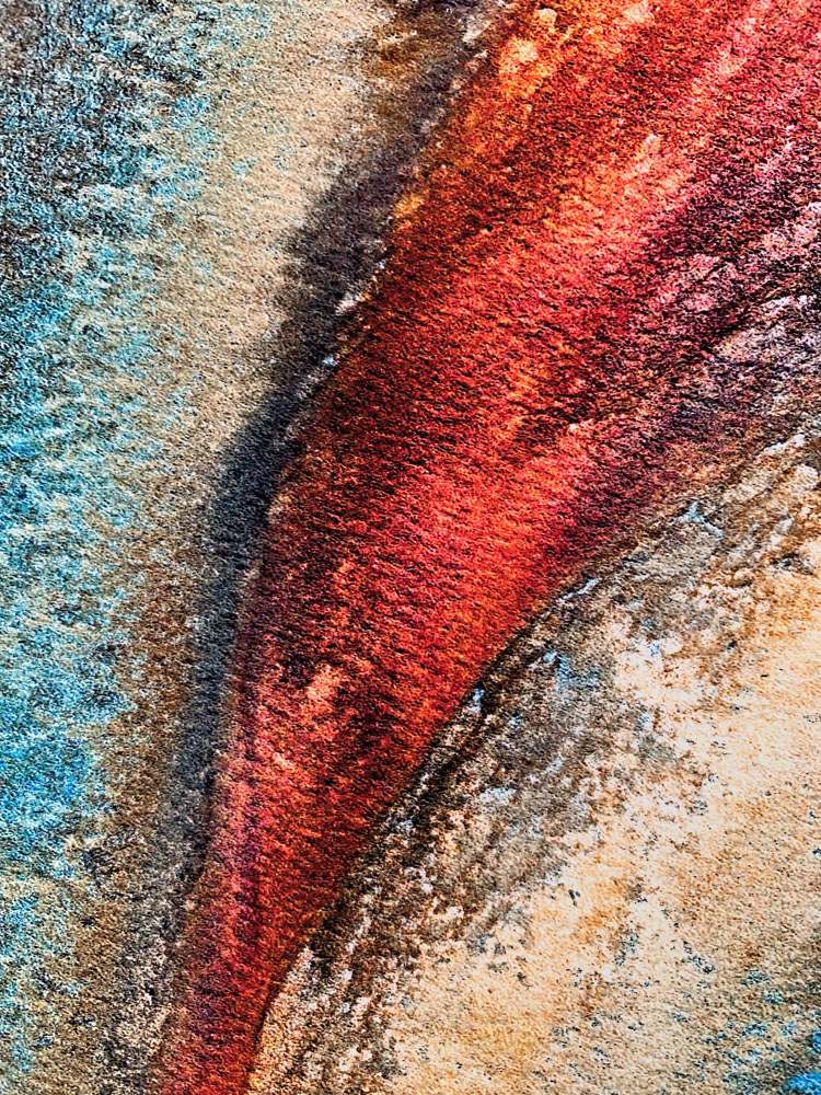
(Above) Detail with too much clarity.
(Below) Reprocessed file with less contrast and clarity - I prefer the contrast and tonality, especially in the reds.